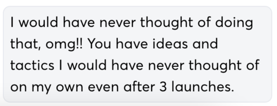
Trusted by course creators with 6-figure launches who’ve “tried everything else” and still felt something was missing.
Only 2 spots available each month! Leave with actionable fixes to stop circling for another 2 months.
Who The Sales page Audit Is For (And What It Actually Helps)
You’ve got an offer that sells… but not as easily as it should.
Maybe you’ve got traffic. Or a past launch that did okay.
But now:
- You’re raising your price
- Shifting from live launch to evergreen
- Or trying to convert more cold leads from ads or affiliates
In all of those moments, what’s happening VISUALLY on your page matters more than ever.
Your sales page is meant to be a closer.
A sales call and Instagram DM replacement. A Decision Engine.
And if people aren’t moving through it smoothly and saying yes faster?
Something’s getting in the way.
This audit helps you:
- See what buyers are actually noticing (and skipping) so you can stop guessing
- Spot trust leaks hiding in your mockups, layout, or testimonials
- Walk into your next big promo 20x more confident your page is pulling its weight
Whether you’re launching with 3 kids home for summer break, have an upcoming launch, or just too close to it to see straight...
If you’re post-copy but pre-confidence, this is for you.
You don’t need to start from scratch. You just need to see your sales page through the eyes of your next customer.
That’s what the BuyerSight™ Method is built for..
Here’s how I find what most Sales page audits miss
Most audits skim. I go five layers deep.
Using my BuyerSight© Method, I analyze how real humans actually experience your sales page when they land on it, not just how it looks to you or your team.
Here’s what that includes:

Real Language Signals
I comb through 100+ data points. From testimonials, student survey responses, and why didn't they buy feedback forms to surface actual buyer phrasing.
→ So the objections your graphics are meant to address reflects what they value without rewriting your copy.

Launch Learnings
I review past sales emails, sales bumps, click data, and performance patterns.
→ So your page builds on what already worked, instead of starting from scratch.

Behavior Patterns
I use Hotjar, scroll maps, and click reports reveal where people hesitate, bounce, or stop reading.
→ It’s not vibes, it’s proof and patterns we can pinpoint.

4. Trust & Visual Flow
I audit your layouts, mockups, hierarchy, spacing, and testimonial placement.
→ To find design friction that breaks trust or slows decisions. (Most sales pages misuse testimonials that break flow in the first 4 sections)

5. Section-by-Section Fix Map
You’ll walk away with a prioritized action plan that goes over what to tweak in each section.
Prioritizing the 4–8 high-impact changes most likely to move the needle, with starter mockup ideas you can drop into Canva or pass to your designer.
This isn’t a templated critique.
It’s done-for-you buyer data analysis combined with visual psychology so every page update leads to real traction, not just more to-dos.

This audit clears that friction, so your funnel or launch performs like it was meant to. Like this client who launched their offer at the highest price point they’d ever used and saw a 10% increase over their previous baseline.
This wasn’t a night-and-day overhaul (they already had a tested funnel), but the design refinements helped them feel confident about the price jump and contributed to a smoother visual flow for new buyers.
I never claim full credit—design is one part of a larger system—but even if just 20% of that 10% gain was influenced by the changes we made, that’s ~$1600 in added revenue from a single launch.
That’s the cost of the audit, already paid back. And most creators launch more than once so those improvements pay off again every time.
If you run an evergreen funnel? You’re compounding that ROI monthly.
ANother Client'S Before & After Changes
What You’ll Actually Get
No guessing and definitely no more Google Docs That Collect Dust

Pre-Call: BuyerSight™ Pre-Audit
Before we meet, I analyze 100+ data points from your real audience:
- Scroll maps, click behavior, and bounce patterns (via Hotjar or available tools)
- Testimonials, survey responses, past emails & launch materials
- Design hierarchy + trust flow using visual conversion psychology
This is where we uncover what your buyers are actually seeing and what they’re missing. Because pages with clear messaging and a strong visual hierarchy see up to 23% higher conversion rates.
(Stat credit: Jeremy Mac)

Live Strategy Session (45 mins) we’ll walk through:
- The exact points where buyers pause, skim, or hesitate
- Where trust is leaking visually, even if your copy is solid
- What to tweak (and what to leave alone) to convert more people, faster
Past clients have changed one section after our session and saw a new sale the same day.

Post Session Delivery:
Post-Audit Fix Map + Mockups
You’ll walk away with:
- A section-by-section Fix Map (+ high priority 4–8 conversion-blocking areas) No vague “maybe move this up” feedback.
- Custom starter mockup & graphic ideas to drop into Canva or pass to a designer
- A full session recording, so you don’t need to scramble for notes
- 14 days of follow-up support via email for “wait—what about…” questions
Another client moved their CTA and tweaked the text to see a 42% jump in checkout clicks. (show an image of a smple mockup next to this with doc)
Investment: $1300
(contact me if you’d like to do 2 equal payments of $700)
Get buyer-backed, visually-driven recommendations that you can actually use this month by knowing your buyers are doing so you can turn skims into scrolls, and scrolls into sales.
This offer does NOT include implementation.
If you’re interested in a done-for-you version, check out my DFY Sales Page Optimization Service!
This digital educator had launched her signature program over 15 times. She’s no stranger to investing in experts. From designers, copywriters, video editors, she came into the audit with familiar frustration:
Despite investing in strong assets, she wasn’t seeing the consistent conversion lift she expected.
“Emails, sales page copy, etc… literally zero impact. HA.”
She didn’t want a full rewrite or rebrand before her spring launch: Just a clear-eyed, experienced second brain that could spot what actually needed to shift to move more buyers across the finish line.
Why She Chose The Conversion Design Audit
“I had several recommendations. I liked what you shared online (Threads), reviewed a few of your past clients, and it was also in the budget of what I wanted to invest for this project. So price point, recommendations, and portfolio.”
She chose the Conversion Design Audit because it offered quick wins without a full teardown and respected the strategy/effort she’d already built over time.
My Approach
This wasn’t a quick design once-over. It was a full diagnostic audit grounded in buyer behavior and messaging psychology.
To make sure every section of Meagan’s sales page worked with her offer instead of against it, I:
- Reviewed past launch data, 400 pieces of audience feedback, 100+ testimonials, and past launch assets to spot where the sales page wasn’t matching what this audience needed to hear
- Mapped her objections and personas to specific testimonial placements, benefit framing, and CTA tweaks
-
Audited tone, clarity, visual flow, and hierarchy (especially above the fold)
-
Delivered a 20+ page Fix Map: section-by-section updates, custom Canva starter mockups, testimonial swaps, and priority fix-it list knowing launch was less than a month away
-
Recorded a walkthrough video so she and her team could implement fast with confidence
The goal wasn’t to tear anything down. It was to elevate what was already strong by bridging the final conversion gaps.
What Shifted
She walked away with a clear list of changes to test and deeper insight into why certain elements weren’t landing with her audience for Conversion Design Audit.
“It’s wonderful to have outside eyes review the page and see it with a fresh perspective."
Proof that even seasoned creators benefit from expert audits that honor what’s already working while cutting what’s getting in the way.
What She Said About the Experience
“You pointed out obvious and not-so-obvious changes that make the page actually more inviting to my audience.
You are undercharging.
I just feel awesome that we have concrete changes that will impact ROI and our launch.”
– Meagan, education-focused course creator in the Pinterest niche
Want a similar result without the full rewrite?
Book your Conversion Design AuditWhy This Pays for Itself
This Isn’t Just a Fix → It’s a Revenue Lever
Your sales page isn’t a static brochure. It’s a living asset.
One strategic shift? It compounds. Across launches, seasons, and price points.
This audit isn’t about working harder. Or driving more traffic.
It’s about making sure your sales page finally pulls its weight.
And when it does?
That’s revenue you get to reclaim month after month.
If ONE change from this session makes you just one extra sale per month (or 3 depending on your offer's price point), this more than pays for itself.
And for most clients it’s not just one extra sale...
It’s better conversions, higher revenue, and a sales page that keeps working long after our call.
This isn’t a fluffy “review” or random conversion tips you could Google.
It’s a hyper-targeted, data-backed plan to make your sales page work for you so you can stop wondering why people aren’t buying.
Ready to turn your “pretty good” sales page into a consistent closer?
Book Your Sales Page Conversion Design AuditFrom Stalling to Selling:
What Buyer Behavior Actually Reveals
Here’s examples of what happens after I run my BuyerSight Method:
I’ll show you two real examples of how subtle buyer behavior insights can make or break a sale from a public sales page and exactly what I’d change to fix it.
(Note: When you see the mouse circling an area, that’s me pointing out what’s holding people back from buying!)
🖥️ EXAMPLE 1: No One’s Viewing the Transformation Image
(And Why That’s a Problem!)
Click here for Example 1 Breakdown:

🖥️ EXAMPLE 2: : They Reach the Testimonials… and Bounce?
Click here for Example 2 Breakdown:
How to Get Started
3 Clicks And You're Done!
① Book your Audit Spot
Choose your payment option, and you’ll get instant access to your intake form and instructions to add me to Hotjar (or other tools if needed).
BAM You're done after step one.
② I run the BuyerSight™ Audit
I’ll review your sales page and audience behavior using my 5-layer method while you're sipping on a good cup of coffee.
③ Get your Fix Map + Mockups
Within 5–7 business days, you’ll get a section-by-section breakdown, smart visuals, and a Loom walkthrough or Zoom call based on your preference.
④ Make the Changes With Support
For 7 days after delivery, I’ll be in your corner via email. Ask follow-ups, share drafts, or gut-check tweaks before you go live.
The BuyerSight© Confidence Guarantee
I’ll only take on your audit if I’m CONFIDENT it will lead to at least 5 needle-moving improvements.
Before you pay, I’ll take a quick look at your page to make sure this is the right fit.
If I don’t think the BuyerSight™ Method will move the needle? I’ll tell you honestly.
Because I treat your page like it’s mine as what’s the point of fixing what’s not broken?
Honest insights. Real strategy. No wasted investment.
That’s what you deserve, and it’s what this audit is built on.

Sales Page Conversion Design Audit
FAQs – Because I Know You’re Wondering
WHAT IF I DON’T HAVE HOTJAR OR HEATMAP DATA?
How is this different from Done-for-You Sales Page Optimization?
I’ve already tweaked my sales page multiple times. Will this still help?
Do you implement the changes for me?
Is this session just for course creators or business coaches?
How soon will I see results?
Still have questions? Contact me here.
This Isn’t Just a Boost. It’s a Better Baseline.
You’ve already invested in great copy, a thoughtful strategy, maybe even a few design upgrades.
But “done” doesn’t always mean dialed in.
Especially when a launch, audience shift, or price increase is around the corner.
This audit clears the last mile of friction
between your reader and “yes.”
So your page doesn’t just look good. It works harder, every time traffic increases. Setting your next launch up to perform on a whole new level.
Because when real people land on your page, every scroll, pause, and bounce tells a story.
I help you read it and rewrite the ending.
Let’s make buying from you the easiest decision they make today.
Limited spots available each month to keep the work deep, not rushed.
Book Your Data-Backed Audit